3 Tips for Building a Mobile-Friendly Landing Page
You ever visit a website on your phone that’s clearly not optimized for mobile?
The text’s too small to read without zooming in, and you gotta scroll around the page to read a full sentence. You try to click on a link and—whoops!—you hit the link right next to it.
Long story short: It’s not fun.
If you haven’t optimized your landing page for mobile yet, chances are a lot of your visitors are having that same frustrating experience. Studies show that up to 68.1% of global website visits come from mobile platforms. That stat also means that mobile optimization gives you a great opportunity to boost your conversions.
In fact, all of your landing pages can benefit from mobile optimization practices, even if you’ve already started optimizing for your smartphone friends.
Let’s talk about getting ready for mobile optimization on your landing page and three ways to improve your landing page visitors’ mobile experience.
Before You Optimize: Understand Your Mobile Audience and Metrics
When you wanna optimize your landing page for mobile, remember to grab two types of info: your mobile audience data and your mobile metrics.
Your mobile audience probably has different demographics, psychographics, and behaviors from your other audience segments. Make sure you understand who these visitors are so you can line up your mobile landing page with their interests and needs. Look at your web and social analytics first to see what other channels, platforms, and brands they engage with.
Get your current mobile metrics together, too. After all, you can’t improve if you don’t know what parts of your landing page aren’t driving conversions. Make a habit of watching your mobile landing page metrics to look for ways to optimize.
3 Ways to Optimize Your Mobile Landing Page
Now that you have your audience and metrics data squared away, try following these three tactics for optimizing your mobile landing page.
1. Design with less space in mind
Mobile landing pages have less space to work with than their desktop counterparts. It’s bound to happen when you’re using a screen that fits in your hand.
When you create your mobile landing page layout, you gotta know which elements to prioritize since you likely won’t have room for all of your desktop version’s parts. Leave space for these big three components:
- Main landing page copy
- Call-to-action button
- Main visual
Once you define the elements you want to keep on your mobile landing page, check that they don’t overlap with each other. A landing page builder will usually adjust content for mobile layouts and offer a mobile preview mode. You can also plug your page URL into Google Search Console’s Mobile-Friendly Test to check its usability.
One of the most important details to keep in mind when designing a landing page for mobile is that most folks navigate mobile sites with one hand. While people usually switch between different holding methods, 75% use one finger or thumb to touch the screen. To make navigation easy for your visitors, keep your clickable elements large and spaced out.
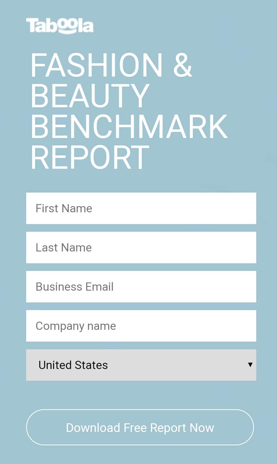
For example, check out how Taboola structured the mobile lead magnet form for their fashion and beauty report:


Taboola keeps its headline in large font and with enough white space around it to stand apart from the form. The form fields and CTA button are both big enough for easy tapping with just a thumb or finger. This landing page section keeps things simple so visitors can fill out the form without trouble.
2. Choose your words wisely
Since mobile landing pages offer less screen real estate than desktop landing pages, you’ll also have less copy to work with. So, you’ll want to make each word—each character—count.
You can jam-pack your copy with impact with the BLUF (bottom line up front) method. As the name implies, BLUF puts your most important information at the start of your copy. It works especially well for converting a desktop landing page to mobile since you’ll have your info to prioritize right at the top.
Once you’ve written your copy, go into editing mode with cutting any fluff as your top priority. Remove redundant words, shorten your sentences, and choose expressive words over wordy phrases.
This Geico landing page embodies the “less is more” rule for mobile copy:


“Steer your way to savings.” By getting a quote or calling Geico, you’re starting the journey to insurance savings. That’s really all you need to know.
Promo also keeps the bottom line upfront with their mobile landing page:


With the headline, “Easily Create Social Media Videos,” Promo tells you the value its app provides in a single line. Then, the subhead “Watch how it works” invites you to watch a video if you want to learn more—no need for more copy.
Editor’s note: We recently analyzed more than 30,000 pages’ worth of data to find out how video affects your landing page conversions—on both mobile and desktop. Hint: It’s not great.
3. Make speed your top priority
Visitors are picky about page speed—especially on mobile. Fifty-three percent of mobile website visitors leave a webpage if it takes longer than three seconds to load.
Three. Seconds.
Unfortunately, a lot of mobile landing pages miss that mark. Seventy percent of the mobile landing pages in a Think With Google study took more than seven seconds to load fully. Oof.
Do you know how your landing page load speed stacks up? Run your landing page through Google’s PageSpeed Insights to clock its average mobile loading speed and get some general advice for boosting it. Then check it with the Unbounce Landing Page Analyzer for landing page-specific recommendations.
If your load times are longer than you want, you have plenty of speed-enhancing strategies to try. There are plenty of technical and granular fixes out there, but you can start with these high-level tips:
- Cut unnecessary content from your page.
- Optimize your images by resizing them, changing their file type, or compressing them.
- Convert your landing page to an AMP page.
(BTW our Accelerate, Scale, and Concierge users can create an AMP page through the builder’s main menu.)
Make Your Visitors’ Mobile Experience Butter-Smooth
Mobile tech is a streamlined version of its desktop counterpart, and your mobile landing page should follow the same principle.
Fine-tune your page to its most essential parts, give ‘em the space they need to make a point, and make sure it all loads lickety-split. When you’re trying to make the best mobile landing page you can, a dedicated landing page builder like Smart Builder will handle a lot of the work for you. It’ll do the heavy lifting on coding, design, and layout so you can focus on creating kick-butt landing page content.
As you work on your landing page, Smart Builder will give you optimization recommendations, saving you time and missed conversions.
